2026-08-14
How to Pass a B2B Buyer's Quick Website Check (And Win More RFQs)
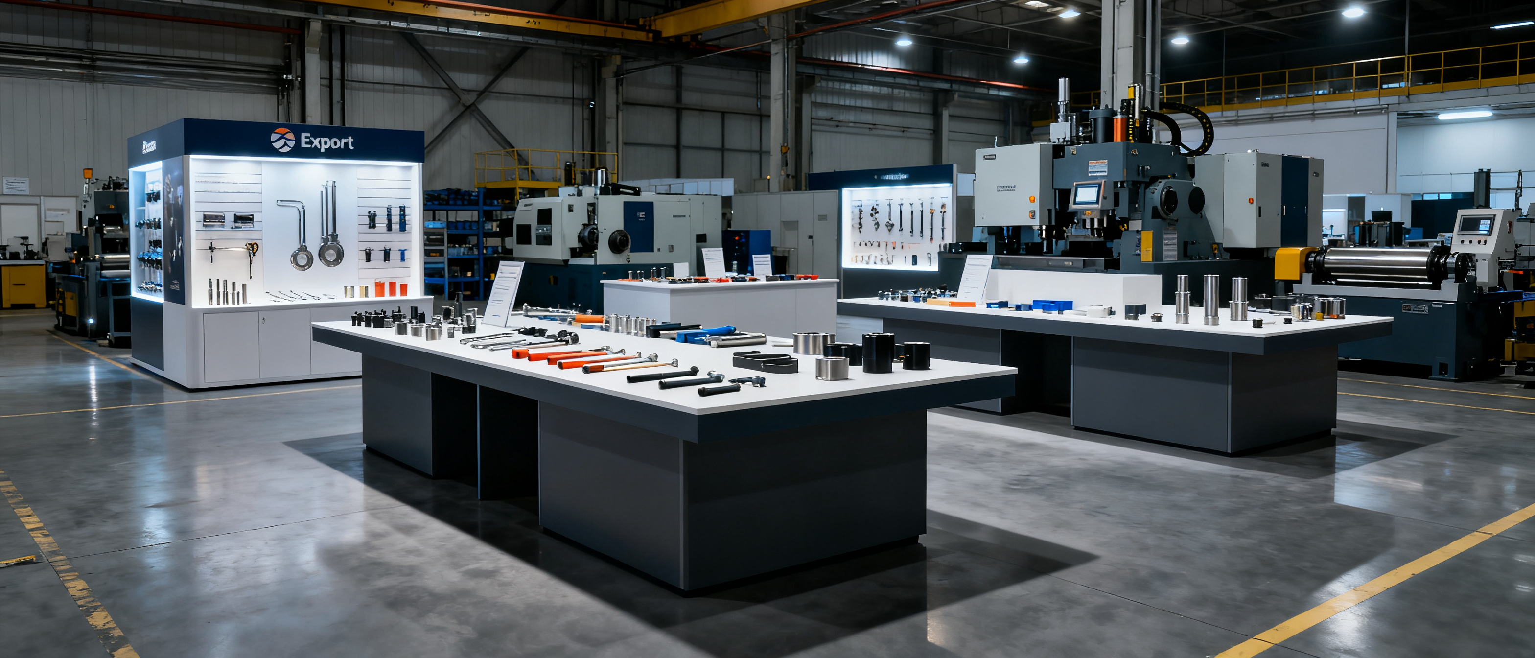
To improve your B2B website’s 10‑second scan, you need to match what a real buyer’s eyes scan in under five seconds. Purchase managers and sourcing agents don’t read—they skim for legitimacy, location, product range, and a clear way to inquire. If your site doesn’t answer those four questions instantly, you’ll lose RFQs before a human ever reads your specs.
What B2B Buyers Check in a 5‑Second Website Scan
Improving your B2B website’s 10‑second scan starts with the buyer’s subconscious checklist. After opening a supplier page, a procurement officer’s eyes move in a predictable Z‑pattern. Within five seconds they decide whether to scroll or hit the back button. Here’s what they actually look for:
- Domain & professionalism. Is it a real company domain (not a free subdomain) and does the page look current, not like a 2008 template?
- Contact & location. Can they see a phone number, a physical address, or at least a country in the header or footer?
- Product clarity. Do the first images and headlines tell them what you manufacture—without jargon?
- Social proof. Are there visible certifications, partner logos, or a real factory photo that isn’t a stock image?
- Speed. Does the page load in under two seconds, or does a blank white screen burn the first impression?
When any of these elements is missing, the scan fails and the buyer moves on. The fix is simpler than you think: surface the facts a buyer needs to trust you, and remove everything else that slows their eyes.
The 3 Trust Signals That Block Inquiries (and How to Fix Them)
Three unforced errors routinely kill RFQs. They act as silent trust‑blockers that make a manufacturer look unverified or even fraudulent.
- Missing real contact details. A “Contact Us” form with no phone number, country, or company name screams broker‑box. Fix: place a direct phone line, a physical address (or at least a city/country), and a business email in the footer on every page. Even a single WhatsApp link can outperform a multi‑field form.
- Stock photography & an empty “About” section. Buyers in B2B trade see the same smiling call‑center photo across dozens of sites. Trust evaporates. Fix: use one genuine photo of your factory floor, your team, or your product line. Pair it with a two‑sentence “About” that states your years in business, main markets, and one specialization.
- Slow load time. When a page takes more than 3 seconds to load on mobile, 53% of visits are abandoned. That’s a direct quote from Google’s own research. A sluggish site sends a signal of neglect. Fix: keep the page lightweight—small images, no auto‑play videos, and a simple hosting setup. Core Web Vitals matter, and you can measure them for free at web.dev/vitals.
Each of these three blockers is a data‑entry problem, not a design problem. You don’t need a redesign; you need to publish the facts a buyer would check in a phone call.
Why a Single CTA Converts Better Than a Hero Slider
Full‑width sliders are the default on many factory templates, yet they consistently hurt inquiry conversion. A B2B buyer scanning a page doesn’t wait for slide two. They see a moving image, interpret it as a banner ad, and scroll past or leave. Multiple studies, including conversion tests by the Nielsen Norman Group, show that a single, static hero area with one clear call‑to‑action (CTA) outperforms rotating sliders.
For an OEM export desk or small manufacturer, the best CTA is often the simplest: “Request a Quote”, “Email Us”, or a WhatsApp button. Place it above the fold, near the company name and a short tagline that explains what you make (e.g., “Precision CNC Machining — ISO 9001 — Shenzhen”). The buyer sees the offer, the trust signal, and the action in one glance. No slider can compete with that clarity.
Structuring a Scannable Manufacturer Page Without a Web Team
You don’t need a web developer to build a page that passes the 10‑second scan. The anatomy of a high‑trust B2B frontage is remarkably simple:
- Logo + company name (top left)
- One‑line description of what you manufacture (next to the logo or in the hero)
- A real photo (factory, team, or product) — not a stock image
- Visible trust marks: certifications, years in business, main export markets
- Direct contact: phone/WhatsApp, email, and a short form — all without scrolling
- Footer with full business address, registration number (if applicable), and a map embed
When these elements are present, the buyer’s scan automatically answers the four questions: Is this a real company? Where are they? What do they make? How do I reach them? You can maintain this kind of page by keeping a single source of business facts—company details, solutions, certifications, and product lines—and assembling them into a site, brochure, and digital card. A managed frontage service like B2B Frontage can handle the technical maintenance, so you never have to edit HTML or chase a web person. For a concrete example, a hardware supplier’s single‑page showcase at demo.getb2bsite.com/hardware demonstrates how a clean layout can satisfy the scanner’s checklist without any team overhead. If you’re looking for a quick audit checklist, the rules distill the must‑haves for a scannable B2B frontage.
FAQ
What is a 10‑second website scan in B2B procurement?
A 10‑second scan is the rapid visual check a buyer performs when they first land on a supplier’s website. They look for signals of legitimacy, location, product category, and a way to contact the company. If those signals aren’t immediately visible, the buyer typically leaves without reading further.
How can I check if my own manufacturer website passes the 10‑second test?
Open your site on a mobile phone, clear your mind, and give yourself five seconds to answer: “What does this company make, where are they, and how do I reach them?” If you can’t answer all three, your site fails the scan. Also ask a colleague who isn’t familiar with your business to do the same test and report what they remember. Their first impression will mirror a buyer’s.
Does website speed really affect RFQ trust?
Yes, strongly. Google’s research shows that a delay of just one second can reduce conversions by up to 20%. In B2B, a slow page suggests an unreliable operation. Buyers interpret speed as a proxy for professionalism, so a fast, lightweight page directly boosts trust and inquiry rates.